Sunday, November 9, 2014

Post Modernism/Contemporary Design

I personally love this style of design. It is very clean and crisp and has a lot of structure to it. Post Modernism actually replaced the International Style. It increased communication and as a result it has become an international profession.

One of the main designers of this period was Louis I. Kahn. He was an American architect from Philadelphia and one of the most influential architects of the 20th century. Some of his main projects were the New Capital of Bangladesh, the Kimbell Art Museum and the National Parliament House. One of the main things I noticed in his work was the use of natural light. He was very concerned with how it revealed form and set the tone of the interior space. All of his buildings allow a lot of natural light through creating nice form within the space.


Another architect during this time was Richard Meier. One of his main pieces of work was the Getty Center in Los Angeles, California which I actually have been to! The architecture is phenomenal and is created of mainly travertine limestone all imported from Tivoli. 


One more architect I wanted to talk about was Frank Gehry. He designed multiple buildings that I find very fascinating. He is the most well known Deconstructivist. He designed the Gehry House in LA, the Vitra Museum in Germany, and the American Center in Paris. While we were going through his work in class, I noticed the Guggenheim Museum looked a lot like the Disney Music Hall I visited in Los Angeles. Sure enough, he designed that as well!


To the left is the Disney Concert Hall and to the right is the Guggenheim Museum. Notice how similar they look and how well thought out they were designed.

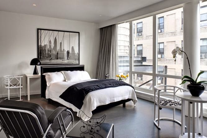
Since I was really focused on the architecture for this period here are some current applications of contemporary design exteriors:

Current Applications:


Extra Video Source:


This video shows some great examples of contemporary interiors!

Reviews: I looked at Rachael's blog and I loved her current applications. I thought they reflected the contemporary style very well and they were interesting to look at. I also liked Natalie's blog because she explained the style in detail. Her history of it really helped me understand it more.


Sunday, November 2, 2014

Rise of the Decorator

The Rise of the Decorator started in Paris during the Art Deco period. During this time there was a need for a wealthy class of people as well as designers to design homes that reflected class and status.

One of the main designers during this period was Elsie de Wolfe. I really liked her style and what she did with her interiors.She was an actress that later decided to go into interior design. Her main focus was restoring Victorian interiors with French furniture and lighter colors. She helped interior design separate from architecture. One quote of hers that I thought was very inspirational for designers was "I'm going to make everything around me beautiful- that will be my life."


This is one interior she designed that I really liked. The bright colors and the symmetry really work well together.

Another designer I really liked from this period was Dorothy Draper. Her interiors were even brighter and bolder than Elsie's. I personally love this kind of style because it is fun and exciting but not too overwhelming.


Her style was very fun and had a lot of patterns. However, they were balanced out with the bold statement walls.

Current Applications:


Reviews:

I reviewed Sammy V's blog and I liked her history section because it laid out the whole timeline of the period. It was very easy to understand and flowed nicely. I also liked her current applications. I reviewed Alex's blog as well and I liked how she talked about each designer and an example of each. It helped break down the period instead of looking at it all together as one.

Since I really was intrigued by Dorothy Draper's designs I found a video with some examples of her work! 


Sunday, October 26, 2014

Modernism in America

Some of the main architects during this movement were Irving Gill and Frank Lloyd Wright. They both designed some amazing buildings that I will post below. Irving was a Californian architect with a Spanish California mission influence. His interiors were simple and unornamented. His best known work is the Dodge House.


The Dodge House to me looks very simple and sleek. I love the sharpness of it.

Frank Lloyd Wright didn't produce as much work in this movement as he had in the past. He returned from Japan in 1922. One of his designs he is known for during this time is the Hollyhock House in Los Angeles California. It was constructed for Aline Barnsdall. It had an extensive garden and highly ornamented terraces.


Another main design he is known for is Falling Water in Bear Run, Pennsylvania. It is designed as one with nature almost. He wanted to bring the outdoors in and he definitely achieved that goal. The large windows and waterfall in the house really exemplify his style.


Another architect that really caught my attention with his designs was Richard Neurta. I thought the Kaufmann House was phenomenal and a really great design. It is so simple yet you can tell a lot went into planning and designing this space.


Current Applications:


Reviews: I reviewed Flor's blog and I loved how she talked about all the houses and what stood out to her in each one. It really helped in breaking down each design and its characteristics. I also reviewed Katie D's blog and I liked her furniture and building examples of this period. I now have a clear picture of what Modernism looks like.

Here is a video that talks about Frank Lloyd Wright's Fallingwater house. It is really interesting and talks about the history behind it!


Saturday, October 4, 2014

Art Deco

The Art Deco period came to the U.S at the beginning of World War II and was strongly influenced by the Art Nouveau design period. Art Deco had skyscraper furniture and many decorations in its designs. The furniture was made of ebony, leather, metals and even glass. Jean Dunand was a major furniture designer during this time. He moved more toward the geometric forms in his furniture. In his factory he produced cabinets, chairs and tables. He also decorated for the wealthy with his own furniture which I thought was pretty cool! Another designer I liked was Eileen Gray. She had a long career in France and after the war she designed screens and furniture. Her furniture was very original and cubist.


Bibendum Arm Chair by Eileen Gray

Another thing I really liked about this period was the textile design. Carpets generally had a lot of zig zag, stripes and plaid designs.


One interior designer/furniture designer I really liked from the PowerPoint shown in class was Joseph Urban. He came to America as a stage designer and designed the New School for Social Research. He also designed a theater that was later demolished called the Ziegfeld Theater. 


New School for Social Research


Current Applications:


I looked at Emily's blog and I liked her examples of the period. They gave a really good picture of what Art Deco stands for. I also looked at Justine's blog and was really intrigued by the video she posted. It clarified all the questions I had regarding the difference between Art Nouveau and Art Deco.


Here is a quick clip that gives you tips on how to design using Art Deco inspirations!


Saturday, September 27, 2014

Emergence of Modernism

The International Style emerged in the 1920's and 1930's and got its name from a book by Henry-Russell Hitchcock and Philip Johnson, The International Style. The three principles that were specified in the book were the expression of volume rather than mass, the emphasis on balance rather than preconceived symmetry, and the expulsion of applied ornament. These principles really became the foundation for the modern style.

The four main architects of this period were Walter Gropius, Marcel Breuer, Le Corbusier and Frank Lloyd Wright.

Frank Lloyd Wright played a huge part in the Emergence of Modernism. He designed over 1000 structures. He had two phases Early Wright and Later Wright. His practice started in Oak Park, Illinois. He designed numerous houses throughout his career.


Robie House


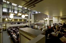
Unity Temple

He used public and private areas within the homes. He made sure even the average person got a beautiful home with the environment incorporated into it. 

One of my favorite examples of this period was the Farnsworth house designed by Mies van der Rohe. He designed it for a woman named Edith Farnsworth. The house was made of glass and steel which was very common during this period. It only has one room as it was designed to be a weekend get-away home. The house is currently a museum open to the public.


I really liked Mies van der Rohe's furniture designs. He really emphasized the whole concept of the International Style. His designs were very simple and used a lot of steel and glass.


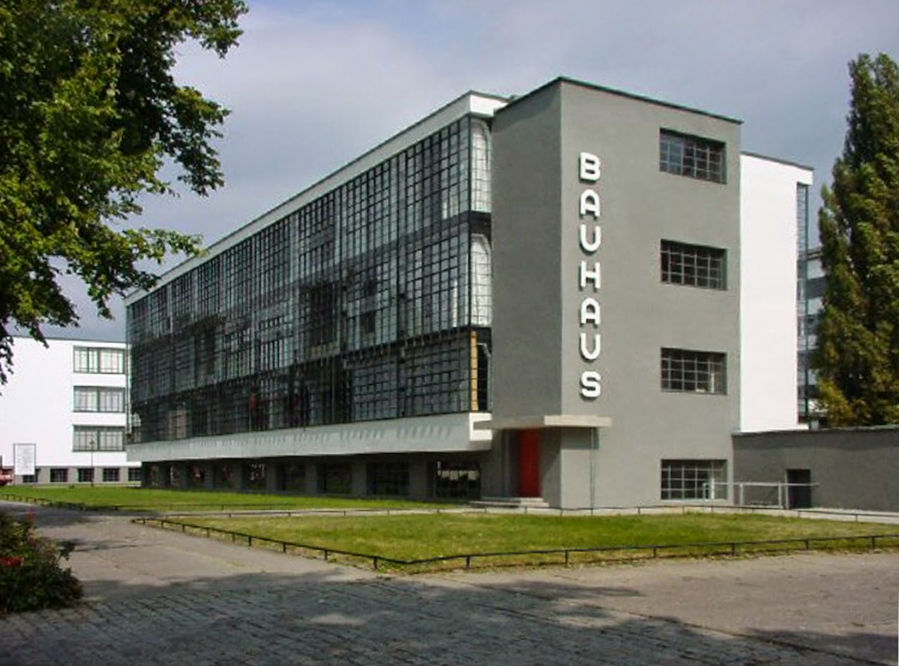
Walter Gropius' style was unornamented, functional and had an industrial feel to it. He formed the Bauhaus school. It later closed due to economic and political problems.


Current Applications:


I looked at Katie's blog and I liked how she broke it up and talked about each architect individually. It really helped me understand each style. Her current applications were also very interesting and intriguing! I also looked at Nicole's blog and I specifically liked how she described the history of this period, it helped a lot with understanding how it all started. I also liked her current applications!


Sunday, September 7, 2014

Deutscher Werkbund Movement

The Deutscher Werkbund Movement began in Munich, Germany and then later developed in Vienna, Austria and Berlin, Germany. It was similar to the Arts and Crafts Movement in the sense of protesting against artistic establishment. However, they did use machines during this time. There was a lot of collaboration between the designer and product manufacturer during the design process in order to increase the quality of the design outcome.

The Vienna Secession was an important part of this period. This was when artists, sculptors and architects all protested against historicism. They were housed in the Secession Building built by Joseph Olbrich. The building was very simple but the gold accents made it unique.


One of the participants of the Secession was Otto Wagner. He was a man from Austria and taught at the Vienna Academy. He designed furniture that reflected his style and architecture.


This is one of the chairs he designed. It has metal braces and usually aluminum or brass shoes. It is very sophisticated and defined.

Josef Hoffmann was also a participant in the Vienna Secession. He was an architect and designer that designed furniture, textiles and glass work.


This is the Morris chair designed by Josef Hoffmann. They usually have a laquered back and a light caned seat.

Current Applications:


This is a link to a video about Otto Wagner and his work. It is a little lengthy but gives some good insight to what his designs were like. 

Responses:

I looked at Allison's blog and I liked how she put a lot of focus on the chairs during this period. It helped me understand how each one was different and the characteristics of each. Also, she did a good job at explaining the history of the movement.

I also looked at Ali's blog and her pictures of the current applications were just amazing. I love that style and would definitely have my house designed like that. Her explanation of the Secession building was also very informational and helpful!

Saturday, August 30, 2014

Art Nouveau

The Art Nouveau period started in France and Belgium. It was focused on thinking outside the box and not going by tradition. During this time Europe was in a period of peace and prosperity. Since there was a lot of economic growth going on, it supported the experimental part of the period. They used the flowing line technique that the Arts and Crafts period used. Artists such as Van Gogh and Edvard Munch shared an interest in Japanese art that soon became very popular.

This period was very cohesive and everyone was involved in the process of designing. The use of modern materials, electric lighting and fine arts became key parts to the period. You will see a lot of ornamentation in these designs such as vines and shells.


Henry Van de Velde was a prominent figure in Belgium. He designed his own house in 1894. He got more into the furniture, silverware, and product design.


These are some of the chairs he designed. The lines and curves on them are very significant and make them unique.

One of the things I thought was very interesting in France with this period was the Metropolitan signs. They are so different and make a statement when you walk by them. Hector Guimard designed the signs and I must say he did a fabulous job!


Current Applications:


Responses:

I looked at Justine's blog and I liked how she talked about Paris and Belgium separately. It showed how they compared to one another. The current applications she showed were phenomenal, the design that went into them was so articulate.

I also reviewed Natalie's blog and I liked how she looked at the specific places such as the Tassle and Horta house. It showed the characteristics of the period in detail and clarified with me what it looked like all put together in a room.


Here is a video that gives a good representation of what the architecture looked like during this period!