The Alhambra is a beautiful Spanish palace that has courtyards, gardens and pools. It was a great achievement of Moorish architecture.
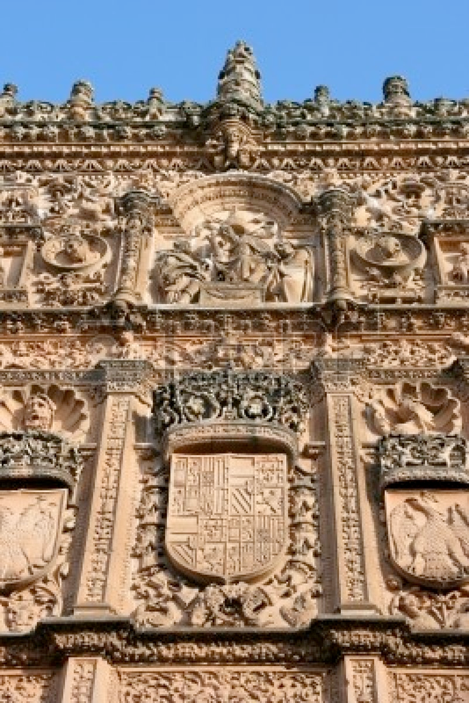
There were two phases during the Spanish Renaissance, the Plateresco and the Desornamentado phase. The Plateresco was a Gothic influence and very delicate in its look. It resembled the look of a silversmith. 


The plateresco phase is on the left, it is more ornamented and delicate. The desornamentado is pictured on the right and it is more plain and simple in appearance. It is usually used on the outside of court and public buildings.
The Escorial is a royal place for monarchy and was completed by Juan de Herrera. It is a highly moral building and very simple in its completion. The overall look of it is breathtaking and pleasing to the eye.
The residential design of this time period used colored tiles and iron grilles to accent the homes. The homes were generally very plain on the exterior so those helped to balance it out. The iron grilles were very popular during this time and can be found on many of their buildings.
This is an iron grille that is usually found on the exterior of windows. It adds depth and design to it that you normally don't see.
The Spanish furniture was usually heavy in proportion and very rectangular. Silver was used for ornamentation and the walnut wood was commonly used for the tables.
Above is a picture of a vargueno, it is Spain's most distinctive cabinetwork. It is commonly known for being used as a desk, but could be used for storage as well.
These are some modern applications of Spanish Renaissance. The detail and ornamentation of these rooms is remarkable.
I looked at Justine's blog and I like how she talked about the architecture and the castles during this time period. They are all just so detailed and a lot of work went into planning and constructing them. She also talked about the Plateresco and Desornamentado phases. She distinguished the two very well and talked about their different qualities. Her current applications were also very cool to look at.
I also viewed Lindsey's blog and I mostly liked how she talked about the current applications. The Spanish design is very bright and detailed. Her interior pictures were very relatable to Spanish design.
Here is a video we presented in class for our Day in the Life presentation. It takes you through Pedraza, Spain and their typical community life.


No comments:
Post a Comment